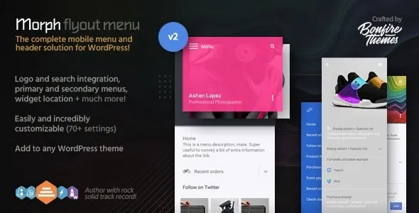
While designed primarily as a mobile menu, Morph works wonderfully on both desktop and touch devices and can be set to be shown at specified resolutions only, meaning – if you so wish – it can easily be used as a mobile-only or desktop-only menu.
Morph is also extremely easy to customize; by changing colors, enabling/disabling and modifying different elements, you can make sure your menu suits your site. It even supports widgets, making it that much more expandable. You can also slide it in from either the left or right side of the screen.


